PCR
- PCR
- 2024
- BRANDING
- ILLUSTRATION
The PCR Project is dedicated to promoting coexistence and reconciliation through educational programs designed to support communities in their process of healing and mutual growth. The foundation required a brand identity and visual materials that would clearly and emotionally express its mission.
PCR PCR PCR PCR PCR PCR PCR PCR PCR PCR PCR PCR PCR PCR PCR PCR PCR PCR PCR PCR PCR PCR PCR PCR PCR PCR PCR PCR PCR PCR PCR PCR PCR PCR PCR PCR PCR PCR PCR PCR PCR PCR PCR PCR PCR

BRANDING
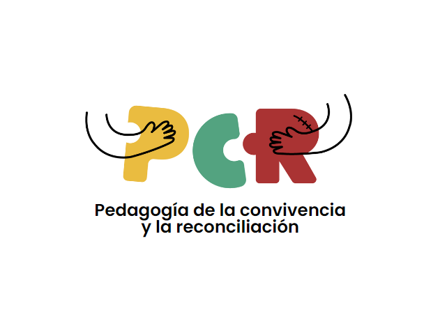
The PCR logo is a symbolic representation of healing and unity.
It consists of the letters “PCR”, where the “R” includes a small scar, representing wounds that are healed through reconciliation.
Two arms embrace the letters, symbolizing support and togetherness.
Each letter is colored to represent a different pillar of the program:
P (yellow) for pedagogy, C (green) for coexistence, R (red) for reconciliation.
This vibrant and symbolic color palette reinforces the foundation’s core values of empathy, unity, and transformation.
Icon & Character Design
In addition to the logo, four icons were designed to represent the key stages of the educational program offered by the foundation.
These icons are simple yet effective, aligned with the visual style of the main branding.
Two characters were also created:
Profe Paz, an Afro-descendant teacher who symbolizes leadership and education in the reconciliation process.
Whatis, a young boy representing curiosity and learning.
Both characters wear the foundation’s logo on their clothing, further integrating and reinforcing PCR’s visual identity.